Wrexham-based band 'Hope Mountain' has become one of my favourite clients to work for over our 3-year-long working relationship. All of the work is pro-bono and as such the band gives me a lot of creative freedom to produce something that I think is visually interesting and appealing.
Working with hope mountain is something I really enjoy mainly because I can chart my progression as a designer through the work I have done for them. Starting with the cover for their single 'white elephants' back in 2019 and neatly ending on the edited re-release of the same song in 2022, you can chart my progression and evolution as a designer through this work and can see how I have improved overall in quite a short space of time.
To date, I have created 4 single covers, an EP cover, and re-branded the band's identity, and I look forward to continuing working with them as they grow and progress.
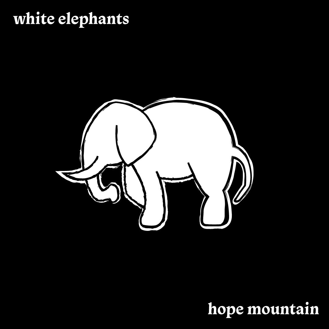
This is the first single cover I created for the band back in 2019.
The brief that was set was to create a cover that looked like a child's depiction of an elephant that had a chalkboard effect to it, ready for the song's release exclusively on Soundcloud.
Looking back at this cover it was very simple, and I'm glad that I got the chance to improve upon this design once the track was re-recorded and eventually released on all platforms.
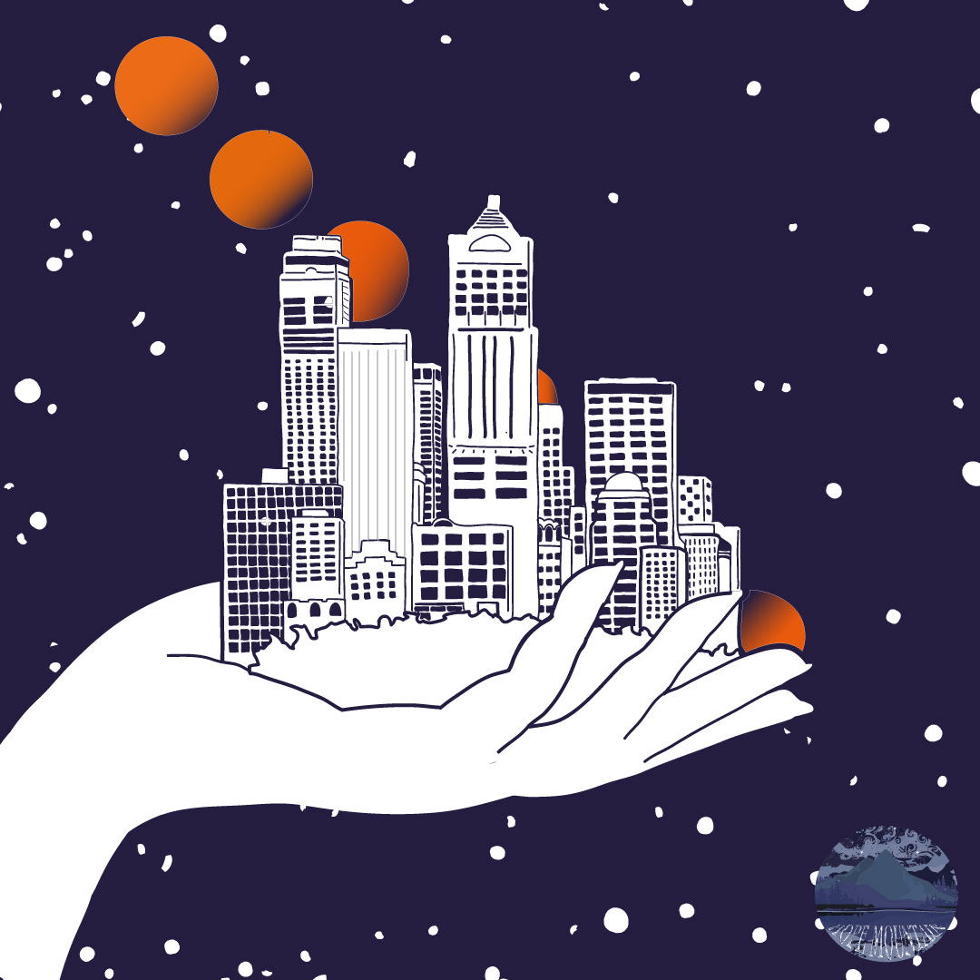
The second cover design I produced was for a track titled 'Lucidity'
This cover was where I started to be given full creative control of the brief by the band, they were trusting me with the idea based off of my thoughts on the title and the song. The only bit of guidance that they gave me was that they wanted me to keep the illustrative style I had used on the white elephants cover and that they wanted this cover to include a city skyline.
The band were extremely pleased with the result of the cover and this design is what lead our creative thoughts for the EP cover that was to come.
In January of 2021, Hope Mountain released their debut EP containing 4 tracks including their single 'Lucidity'.
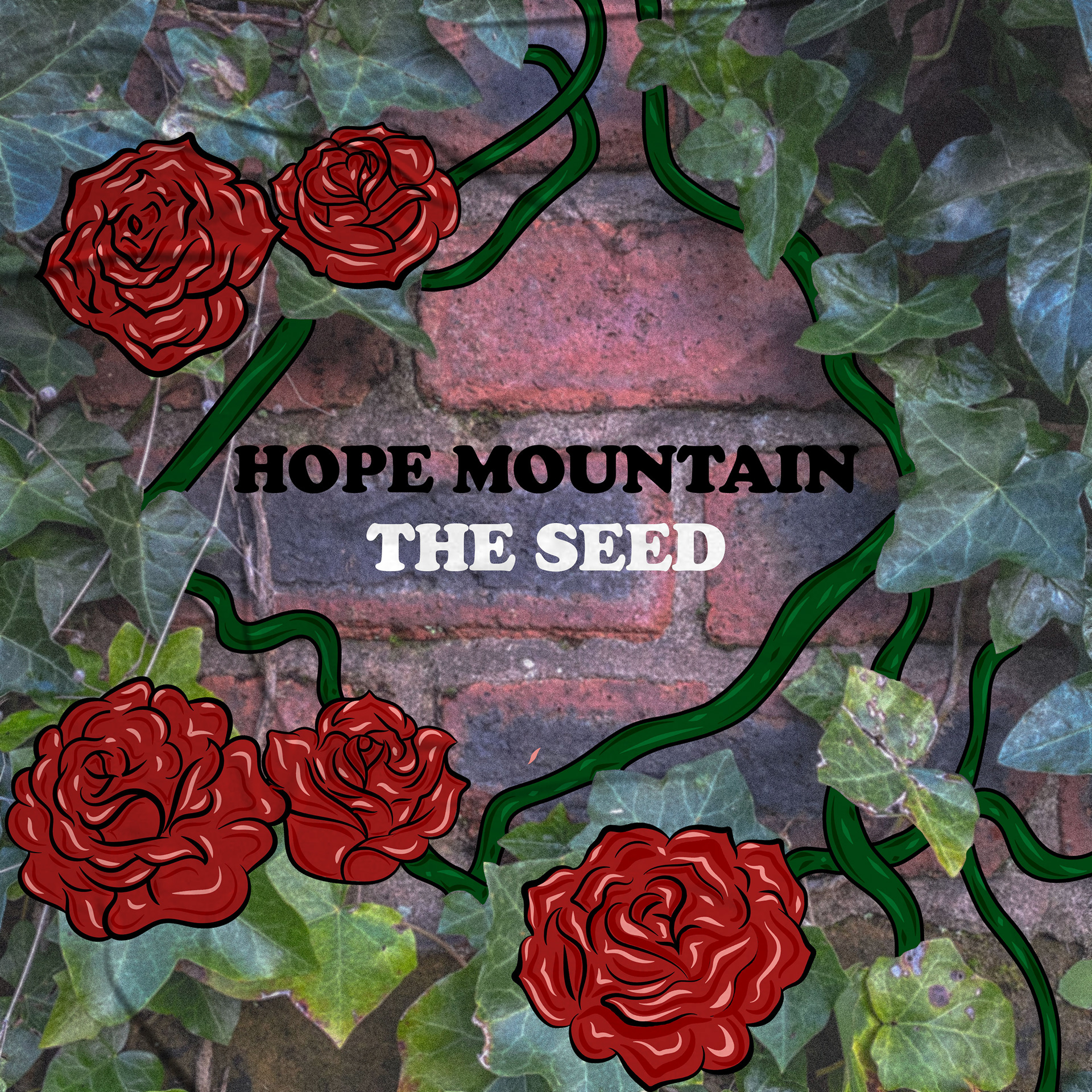
For this cover the band didn't have an idea of what they wanted and therefore left it completely open for me to run with creatively. I decided that the illustrative style we had used in the lucidity cover should still remain, but I wanted to merge that with a photographic element this time.
The idea for the cover came to me before the name of the EP had been decided. The band gave me the tracklist to listen to see if it would give me any inspiration and just looking at the name of one of the tracks, 'the seed', gave me images of plants, flowers and growth. That is when we decided that the name of the EP would be titled after the track and be called 'the seed'.
Once we had decided on the name I came up with the idea to have a photograph of real greenery be merged with illustrated flowers. As you can see by the final product I think that we pulled this off extremely well, and I am still very proud of this cover design and the fact that I had so much creative influence over it.
After their successful EP release hope mountain once again contacted me in 2021 to design the cover of another single, titled 'magazines and movie screens'
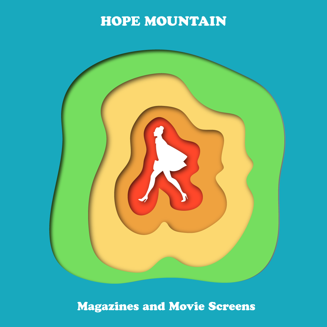
Once again they left the majority of creative freedom to me but did say that they wanted the cover to feature the silhouette of a woman.
The song felt very lively and upbeat so I felt that the cover should project some of that energy and be very vibrant and colourful. It also had a very 60's psychedelic rock sound to it and I wanted to incorporate that somehow.
My answer to this was to create what you can see to the left. I used very bright distance colours in a cutout fashion to highlight the shape of the woman in the centre of the image. I think I did a very good job at portraying the energy of the song through this cover and once again the band were over the moon with the results.
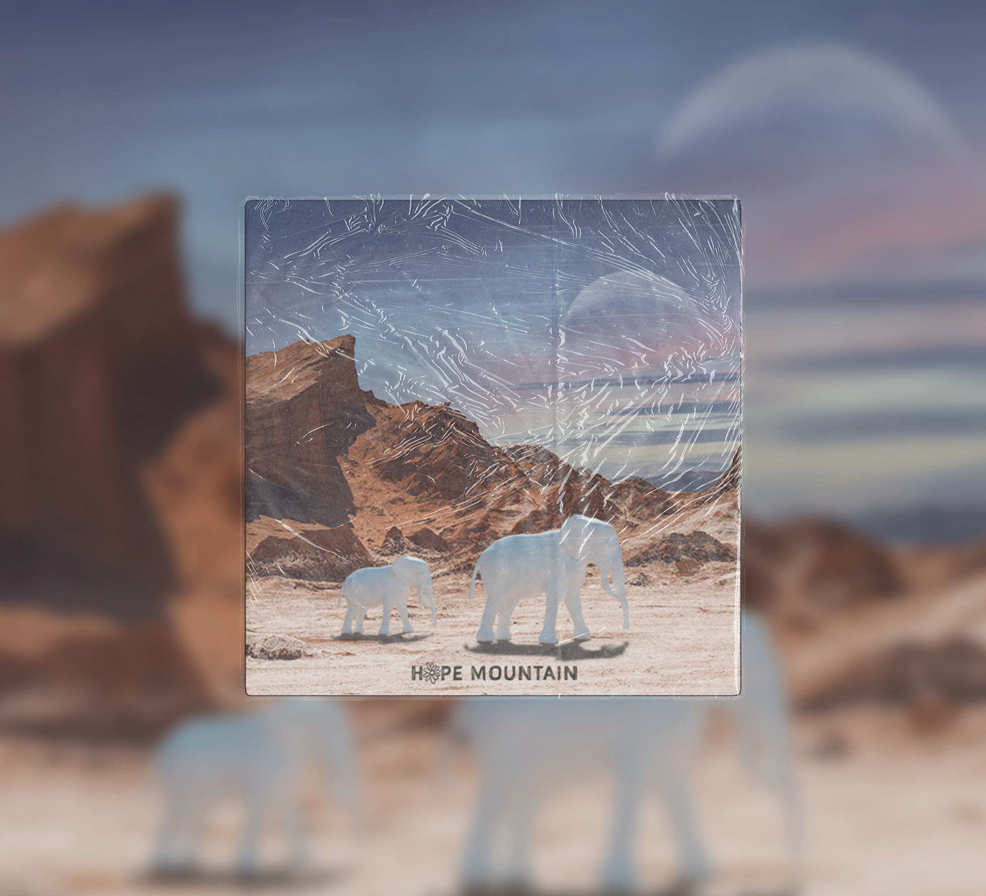
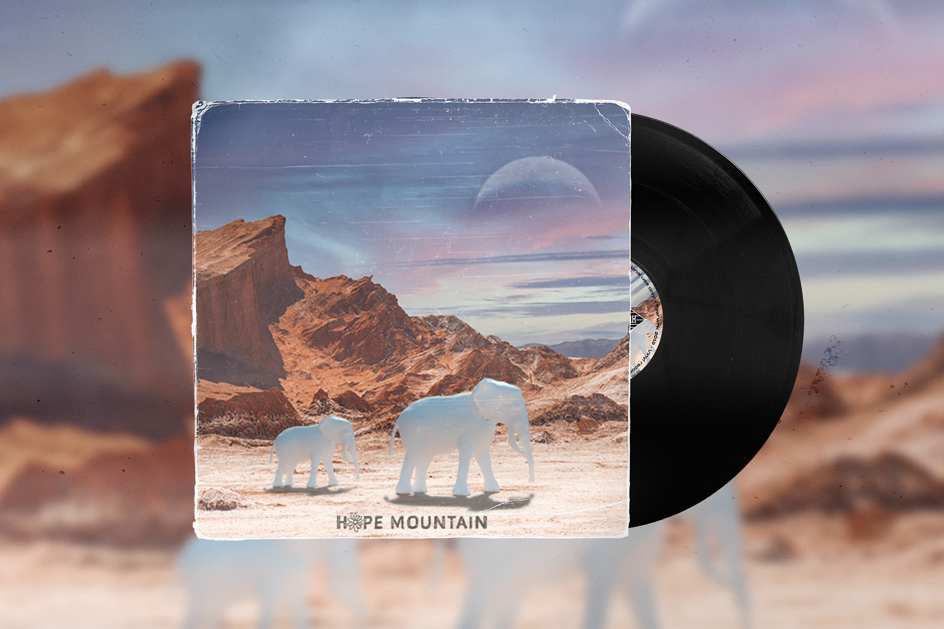
In Late 2021 the band once again returned to me and this time with a request for me to completely re-create the cover for their first ever single 'white elephants' that they had re-recorded and were planning on re-releasing on all platforms.
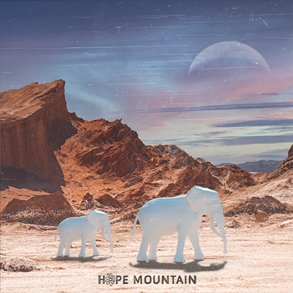
I was very pleased with the opportunity to redesign this cover and I feel In really did a great job. I was given complete freedom other than the request for the cover to still include the white elephant and I decided to take this version in a completely different direction. I had been learning 3D design and saw an opportunity to use this work to improve my skills, so we decided to create a surreal landscape with the white elephants walking through the scene.
I think this cover really symbolises the progression I have made as a designer and I am still extremely proud of it. There were a lot of things that I had to learn from scratch to be able to create it but I think all of my efforts were rewarded and the band were so happy with the outcome so it was an amazing feeling once the single got released on all platforms.
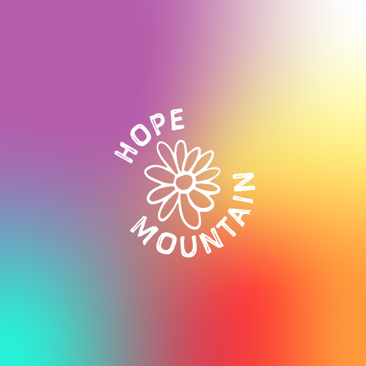
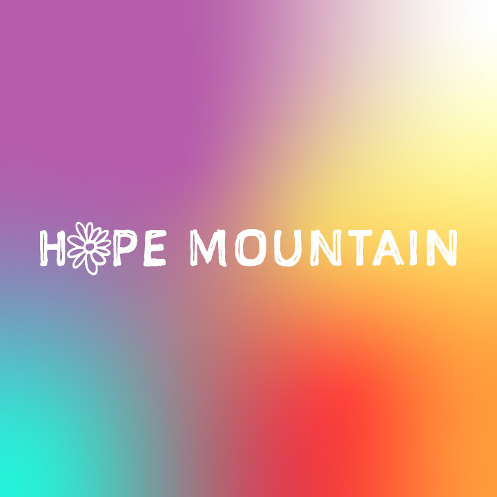
Finally, to accompany the re-release of the 'white elephants' single, the band decided that they would like me to look at their overall branding
and create them a new logo and identity.
and create them a new logo and identity.
My inspiration behind the logo design was based on my knowledge of the band as people, what the band represents and the music they release.
The flower represents the growth of the band and also links back to the EP design I created for them. It also comes from the feeling I get when I hear the name of the band or the music they produce. The sound is very organic and natural and the idea of a mountain gives me images of looking out over nature and rolling fields full of flowers. I paired the icon with a typeface that represented the rough, imperfect nature of the bedroom-style recordings the band produce that gives them so much character and originality. And then finally I used a gradient to symbolise the colour and energy that the music gives off when you listen to it, and also to represent the fluid, evolving nature of the band's identity and music.
The flower represents the growth of the band and also links back to the EP design I created for them. It also comes from the feeling I get when I hear the name of the band or the music they produce. The sound is very organic and natural and the idea of a mountain gives me images of looking out over nature and rolling fields full of flowers. I paired the icon with a typeface that represented the rough, imperfect nature of the bedroom-style recordings the band produce that gives them so much character and originality. And then finally I used a gradient to symbolise the colour and energy that the music gives off when you listen to it, and also to represent the fluid, evolving nature of the band's identity and music.


